We were born to buck the system
We're challenging the status quo, and we live this through everything we say and do. It's how we show up as a bank, and the mindset we want Kiwi to experience — bold, fair, and willing to do banking differently to make Kiwi better off.
We're at our best when we challenge the default way banking is done, and we do this to make Kiwi better off.
Everything we do comes back to our purpose — we'll never stop pushing to make more Kiwi better off."
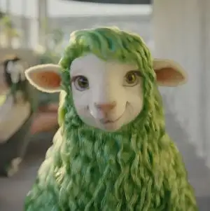
Buck has found a bank that's bucking the system too
Buck is our character, a keen customer of Kiwibank. She has no interest in doing what the flock expects. She's tired of the status quo, curious about what's possible, and always looking for a better way forward.
This is Kiwibank
Our identity and logo are inspired by the concept of a thriving Aotearoa and were designed around the te ao Māori metaphor for a thriving whānau and community which is symbolised in pā harakeke.
Modal to play video
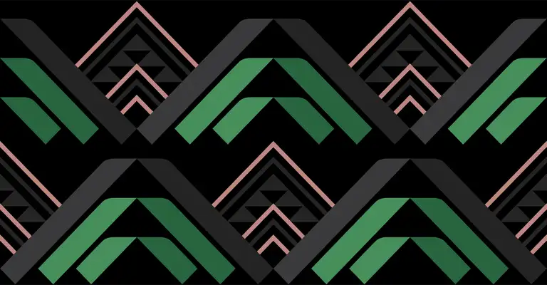
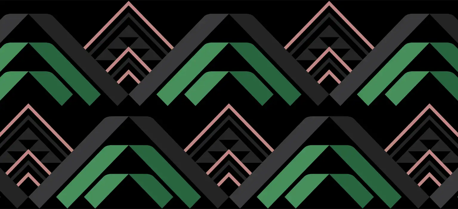
The Harakeke plant is at our centre
In te ao Māori, a pā of Harakeke symbolise a thriving whānau and community. The outer leaves are the tūpuna, our ancestors, representing knowledge and wisdom. The inner leaves, the mātua or parents which protect and nurture the central new shoots, being the tamariki or children – the next generation and future growth. It’s a metaphor of our brands promise and expression and represents where we are today and where we’re going.
Our logo is formed of a Harakeke leaf reaching for the sun – alive, folding and twisting.
The folding Harakeke leaf is the hero of our identity system along with the wordmark. The frame is open, made from a slender leaf that can frame our stories.
The combination of both the dark and bright green along with the fold delivers three-dimensionality and again is inspired by the Harakeke leaf. The darker green being the shaded side of the leaf whilst the brighter is the side lit by the sun. The greens represent the best of Kiwibank and the introduction of black and white are synonymous with New Zealand.
Our brand colours are born of the Harakeke plant. They’re a nod to our past and an expression of our future.
- Karerā | Bright Green | The pursuit of growth
- Kākāriki | Dark Green | The mana of the great trees of the forest, maturity
- Te Pō | Black | The realm of potential
- Puāwai | Dusk | The flower blossom a metaphor of a healthy plant, where the bellbirds land to sing
- Te Ao Mārama | Clear & White | The colour of enlightenment and aspiration
Guided by our Tohu | Symbols
As part of the identity, multi-disciplinary Māori artist Tristan Marler (Manawa Tapu) designed a set of tohu (cultural motifs or symbols) that represent our brand attributes. The Harakeke leaf forms the tohu and patterns that convey the three pathways toward a thriving community; Kia Marama, Kia Maia and Kia Manaaki.
Kia Manaaki / Show Heart

The Patiki pattern communicates balance between people and environment to produce a thriving, resilient community that can manaaki, or care, for others. When the environment is thriving, it enables people to thrive.
Kia Mārama / Know How

The Poutama pattern symbolises the pathway to higher states of enlightenment. It represents attaining knowledge that helps communities thrive. It inspires us to seek new and innovative solutions for the evolving needs of our customers.
Kia Maia / Be Bold

The Niho Taniwha pattern symbolises strength in leadership to navigating new pathways. It encourages us to represent our communities with courageous leadership, helping people participate and pursue their aspirations to thrive economically and culturally.
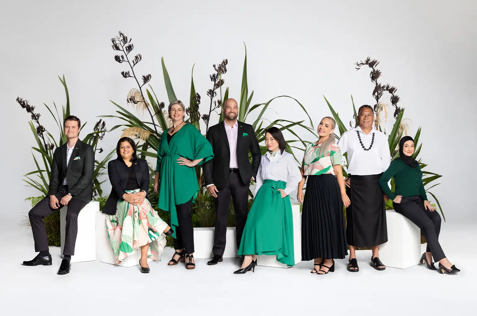
The Kiwibank Wardrobe
To better reflect modern Aotearoa, we collaborated with five leading local designers Barkers, Jen Sievers, Kiri Nathan, Little Yellow Bird and Standard Issue, to reimagine the workplace wardrobe. We're excited to launch the 46-piece collection which considers choice, accessibility, gender neutrality, and cultural and religious preferences to encourage our people to express their individuality.
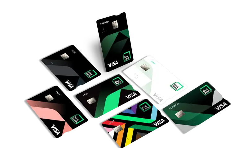
Kiwibank card designs
We want our cards to be a reflection of our inclusive culture, giving you the choice to stand with us in what we believe in. Our card designs incorporate interpretations of a Harakeke leaf, our visual expression of the concept of thriving, reaching for the sun, alive, folding and twisting. In Te Ao Māori, a pā of Harakeke symbolise a thriving whānau and community.
There are different Visa debit designs for you to choose from – just take your pick. The Rainbow design features Te Kahukura Kāpuia (referencing 'multicoloured', and ‘to gather or unite as one’), as a symbol of the pride we have in our Rainbow Community.